
The colour wheel takes a spin towards warm autumnal tones, says interior designer and Farrow & Ball chromologist, Patrick O’Donnell
Farrow & Ball is the richly pigmented UK paint company with names for its colours that rival those of the fashionable lipsticks.
It’s been 20 years since Farrow & Ball colour curator Joa Studholme launched Elephant’s Breath, a deep mid grey that epitomised the zenith of the Celtic Tiger years and the stormy weather years of the recession that followed.

It became a modern neutral, wiping magnolia from even the tamest of paint shop requests.
But the world keeps spinning, and moods shift. And the outlook now, in an uncertain world, is a return to a more homely look.
“Paint is an important tool. Colour is the glue. It should never scream. It should be background”
Cottagecore tore up the internet, crafts and hobbies have made a comeback, and grandmother-era looks such as café curtains, crochet tablecloths and stoneware dupes are all the rage.
This shift is illustrated by the launch of new colours by Farrow & Ball earlier this year. The firm brought a baker’s dozen of new shades, 11 new hues and two from its archive, to help the house proud shift gears accordingly.
“A room is more than a decorated space, he says. It’s about the objects in it, the furniture, the light”
The company’s brand ambassador is chromologist Patrick O’Donnell, an interior designer who understands how to use the paint’s range in both period and contemporary settings.

Of Irish extraction - he lived on the Ards peninsula in Co Down for a long time, a place his great, great, grandfather came from – he feels our island nation may still be somewhat afraid of colour indoors.
“In Ireland, you use colour a lot on the exterior of the buildings,” he says.
He’s right. Every town and village demonstrates this, but it is Eyeries in west Cork that makes it onto most Insta feeds.

In contrast, he says that in an indoor setting, the English have never been afraid to play with colour.
“It’s quite a layered effect, textured with lots of classic fabrics from chintzes to inverted stripes. In part, it’s not giving a fig what other people think, not being moved by other people’s opinions. It is decorating for yourself.”

He believes a room is more than a decorated space. It’s about the objects in it, the furniture, the light.
“Paint is a really important tool. It covers the largest surface area. A room is the sum of its many parts: the floor, cushions, and furniture. Colour is the glue. It should never scream. It should be background.”

The new colours feature names that as equally beguiling as Elephant’s breath.
They include a very soft-shell shade called Scallop; Sizing, a blue-based neutral; Duster, a deep ochre; Broccoli brown, a quiet shade that adds depth and warmth; Dibber, a muddy khaki; Douter, a smoky green-grey; Reduced green, a deep forest shade; Naperona, a very soft terracotta; Marmelo, a ground spice shade; and Kakelugn, a clean light blue that heralds a move back onto the cool side of the colour wheel.

Etruscan red and Sap green are the two shades selected from the archive.
O’Donnell loves classic autumn colours, the chocolate browns, wines, reds and ochres.

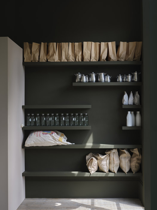
“It’s a time when we watch a lot more TV. Duster, seen above, is a good mid to dark shade if petrified of true yellow. A dirty Dijon that is a little more subdued. These richer colours will help you hunker down and watch.
“Embrace the darkness of the evenings drawing in.”


