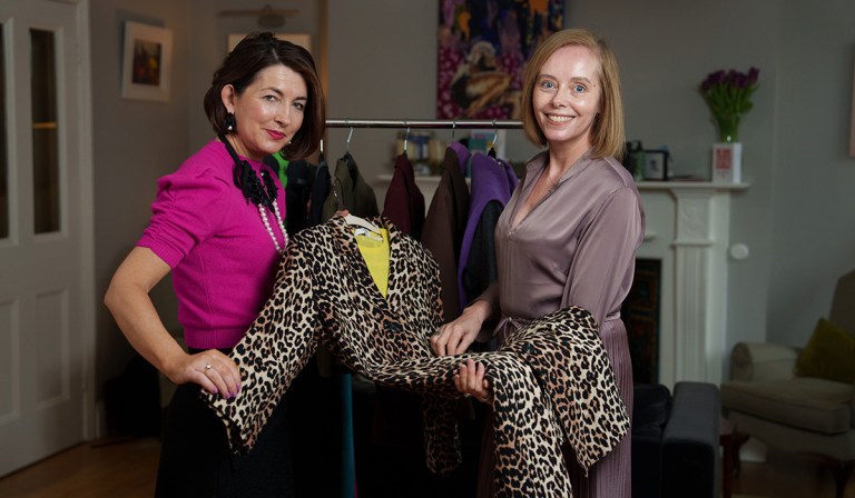

I am sitting in Aoife Dunican’s kitchen on a dull February morning while she drapes swatches of coloured cotton under my chin and gauges their effect on my make-up free face.
Aoife, a stylist, and public speaker also known as The Style Bob is an image consultant and she is analysing my colours.
She highlights how some hues bounce light off my face, lifting it, while others cast shadows, emphasise lines and drain me. The aim is to identify the most flattering shades that complement my natural complexion, hair colour, and eye colour.

Recently I have been feeling that I should incorporate more colour into my wardrobe. This desire for colour has been creeping up on me gradually.
It might be the spring light, the sense that I am jaded after a long winter, or that my complexion needs an energising boost, but I am craving colour.
Aoife is passionate about colour: she uses it to give impact to her clients, and to optimise communication, confidence, and presence. Colour is transformational not just in terms of how we look but also how we feel, and for Aoife it is vital. ‘It’s amazing how colour affects us and also affects people,’ she stresses.
‘We see colour in wavelengths of light – because colour affects us psychologically and physiologically,’ she explains.
The power of colour to communicate is also instantaneous. Colour analysis first peaked during the Eighties thanks to a book called Colour Me Beautiful by Carole Jackson.
Lately it has been enjoying a revival thanks to TikTok where colour analysis posts have accumulated almost 750 million views.
In our modern tech era, you can use virtual draping apps to analyse your shade season, but I have opted for Aoife’s expertise to explore how to wear more colour. But what are the right colours?
There are four colour seasons spring, summer, autumn and winter with spring and autumn defined as ‘warm’ and summer and winter defined as ‘cold’.

These classifications refer to the tones in the palettes for each season. People with a warm undertone fall into the autumn or spring seasons, and are flattered by yellow-based hues, while those with a cool undertone fall into the summer or winter seasons and are suited to blue-based hues.
In advance I have filled out a questionnaire that aims to establish my personality (introvert or extrovert) and the kind of colours I love and wear.
Aoife starts by draping a pale pink which she says is unflattering, and next a bold pink is also a no, as it is ‘dead on you’. A warmer shade of pink is judged ‘much nicer’ because it emphasises my blue eyes and makes my skin tone appear ‘neutral’.
Aoife advises me to ‘up the lipstick a bit more’ to a ‘more pigmented salmon because we don’t want our hair, skin and lips to be the same.’
As we drape various shades of blues, greens, yellows and reds, Aoife begins to establish that I am an autumn with warm skin undertones. The warm colours make my face look brighter and healthier but cool ones drain the vibrancy from my features.
‘The earthy shades of Autumn are you, but I still want you to have them pigmented with a bit of depth in them – nothing too pale,’ Aoife says. ‘People think autumn shades are all dirty shade... all the terracottas. They are, but they’ve also got these beautiful shades as well.’ (The autumn palette includes pink, turquoise, red and orange.)
I am also a strong secondary spring so I can wear the shades in that palette too. ‘What I say to people about seasons is that I always give them a primary season and a secondary season. … You don’t want to box people,’ she adds.
Now she says, ‘I want to give people more freedom and when I do colour on people, I more try to educate them on it. For me it’s the outfit combinations – it’s more about that than anything else because otherwise it’s like anything – too rigid,’ she says.

As she progresses, I can see the impact the right colours have, as they make my eyes pop, and my complexion glow. Colours that are unflattering appear to ‘wear me’ rather than me wearing them.
Conversely a flattering colour makes my complexion alive and smooth: ‘We want our skin to totally even out and look healthy,’ Aoife advises. We agree about everything except a bright lime green which she says is ‘lovely’ on me, but I dislike.
She acknowledges my reaction saying, ‘So much colour is down to personal preference as well. Somebody might say to me, ‘This will suit you’ and I’ll go ‘I hate that colour.’
‘Fabric is crucial to how a colour translatse or comes across and can look totally different in a matt cotton than a lustrous silk,’ she adds. Expanding on this she adds, ‘You should always buy a good black’ but ‘if going cheaper, then get it in your most beautiful shade, because we see colour before we see cut.’
‘My personal love of colour is not necessarily the analysis bit; it is the pairing bit. And that’s where you can create distinction in your outfit in terms of curation,’ she says.
When working with clients who claim to have ‘no clothes’, she proves them wrong by styling new outfits in interesting colour combinations. And while she loves colour and is known for it both personally and professionally, Aoife strongly emphasises the role that neutrals play in a successful wardrobe.
She observes that people often have too many colours and not enough key neutrals, which means it is hard for them to create outfits. In summer, she says that rather than pairing a bright cerise with white, which can ‘jar’ she would opt to pair white with what she terms ‘non-colours’.
This creates more cohesive and versatile options with these non-colours including taupe, grey and light lavender. ‘Taking this approach to your wardrobe, especially in summertime means you always have things working together, because all these colours sit together, so you always have an outfit ready,’ she explains.
‘People see neutrals as boring, but for me there’s two things I do with neutrals: one is wearing them in different textures’ (she points out a grey tweed with a grey knit and a metallic necklace). ‘Texture is so important,’ she stresses. ‘The other way is to take a neutral and really use the neutral to pop the colour that you have.’ She cites how ‘a mushroomy grey is great with both hot pink and orange’ as an example of successful colour combinations.
‘Never look at colours just in isolation: neutrals can make brights more wearable by softening them and toning them down, and making them look more sophisticated,’ Aoife emphasises.
‘That’s where people are looking at colour too much in isolation, and the bit that excites me and the bit that makes the look curated, is the textures and how neutrals are used with colour.’ Later she repeats, ‘That’s the thing with colour, it doesn’t have to be full on, but your neutrals are so important. People have to stop seeing neutrals as blah... You can’t wear the colour without the neutrals.’

And while she loves black, she has strong opinions on it. ‘I think a lot of people fall into black - black with everything. And I think with black sometimes, you wear it in the wrong way for two reasons: first of all, it is to make us look slimmer but again if you wear the one shade the whole way down it has a lengthening effect on the body.’ Any shade worn top to toe will elongate, it doesn’t have to be black, she emphasises.
‘Even with someone curvaceous, you can use colour to move the eye to your best part.’ As a ‘soft pear shape’ she wears bright colours on her torso ‘to move the focus north of her waistline, because I want to create balance in the body.’ This is a simple trick to mask proportions and one she uses with clients to stop them always thinking of black as ‘that skinny colour’. If you constantly wear black to appear thinner ‘if that’s not reflective of your personality, is not ideal,’ she adds.
‘Over 50, you can become invisible very quickly and you need to look at what you can wear especially in colours, to be more visible,’ she asserts. However, she is sensitive to the personality of each client, especially if they are colour-shy: ‘It’s a subtle thing. And if I’ve someone, especially if the person is very bright and outgoing, I’ll say, “Look, will you even try a scarf for me? Why don’t you try even a top – see how it feels?” Introverts won’t wear bright colours, even if they are their shades sometimes – you need to find the middle ground,’ she concedes.
As she describes the qualities associated with colours: black represents power, red - energy, purple - wisdom, coral - friendliness, yellow - clarity and joy, green - renewal and balance and blue - trust, loyalty, and communication, you appreciate the impact of colours apart from mere fashion. For Aoife, image is about using your right colours and neutrals creatively in combination. When she admires stylish women, it is due to how they have put their outfit together overall.’ For me, a look is the sum of its parts,’ she says.
With so much fashion consumed today, she admits that there is a lot of confusion around getting dressed. There is too much choice, so people are seeking simplicity and certainty by adopting systems like capsule wardrobes and colour analysis for clarity. Decision fatigue is a real issue for women confront bulging wardrobes. One rule Aoife applies, ‘The pieces you wear the most should be good stuff. I’m a big believer (it’s how I dress myself personally) the more simple and neutral it is, the better it should be.’
‘The bit that excites me, will not necessarily be the colour analysis piece, it will always be how you can wear it to be interesting …. and show your proper creativity with style. You can do interesting pairings - you don’t have to spend a lot, because the colour will speak for itself.’ Oscar Wilde echoed the same sentiment when he said, ‘Mere colour can speak to the soul in a thousand different ways.’ With those words as inspiration, Aoife’s expert advice and my new colour confidence, I will now embrace colour to create unique looks for a brighter spring.
See more at thestylebob.com.